- BY braincandy
- POSTED IN Website Design & Development
- WITH 0 COMMENTS
- PERMALINK
- STANDARD POST TYPE

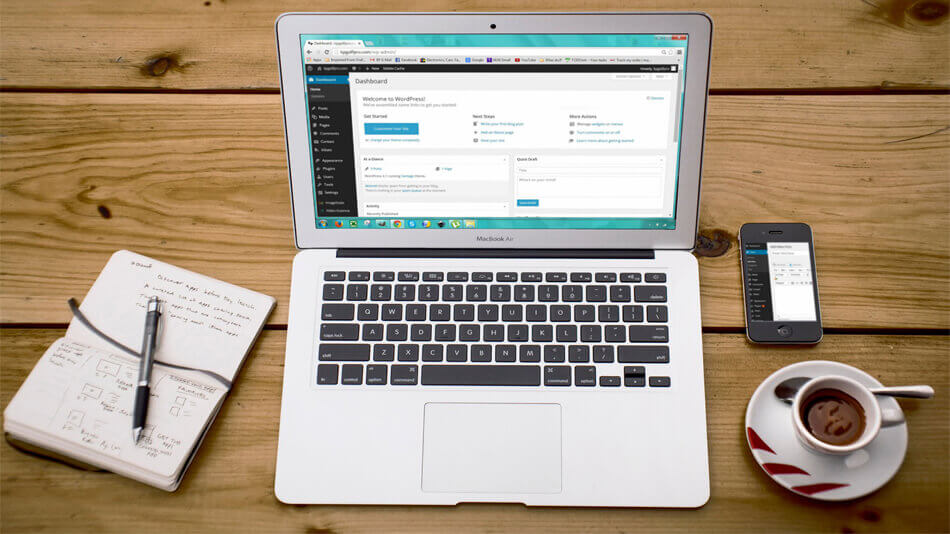
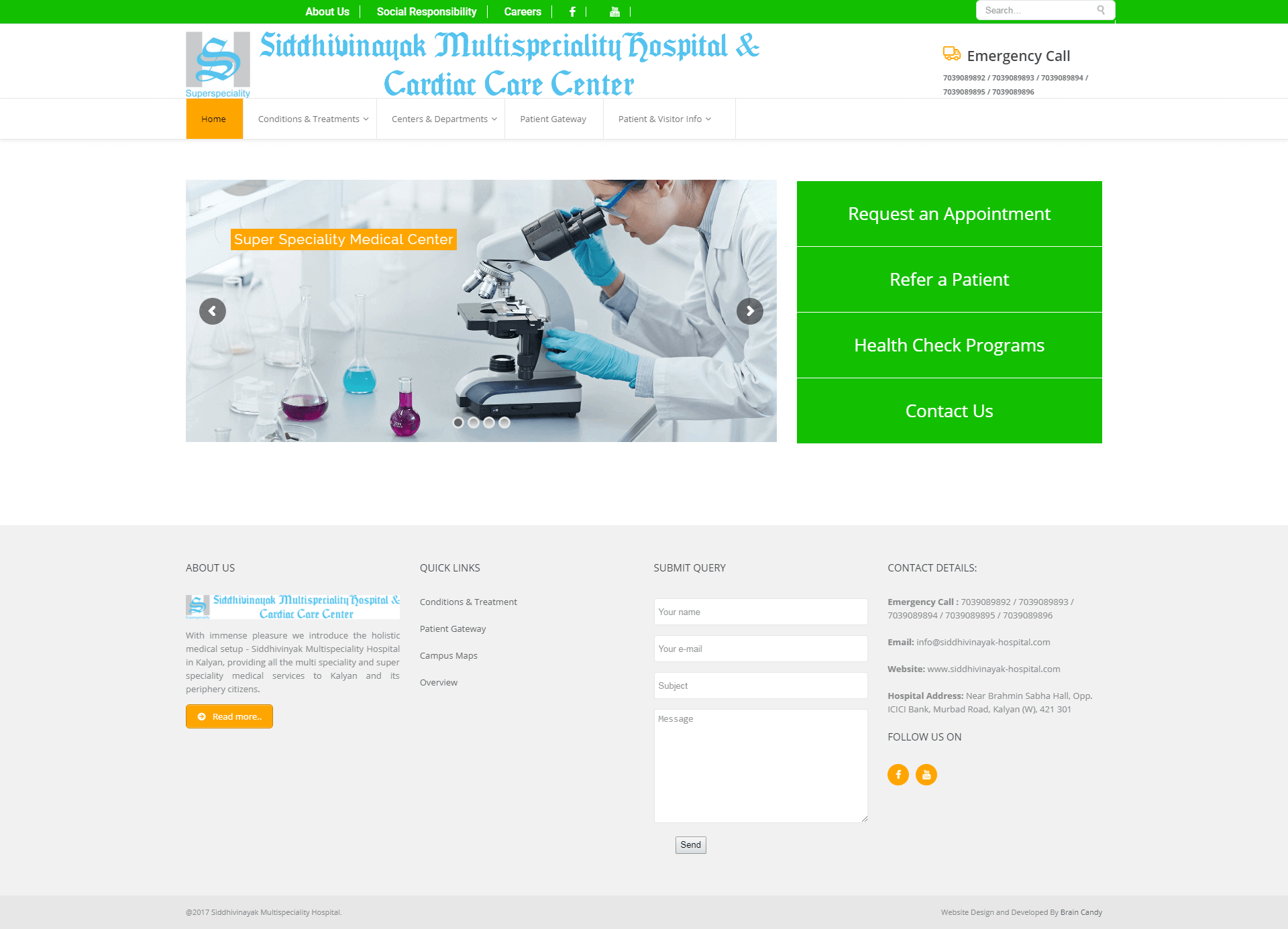
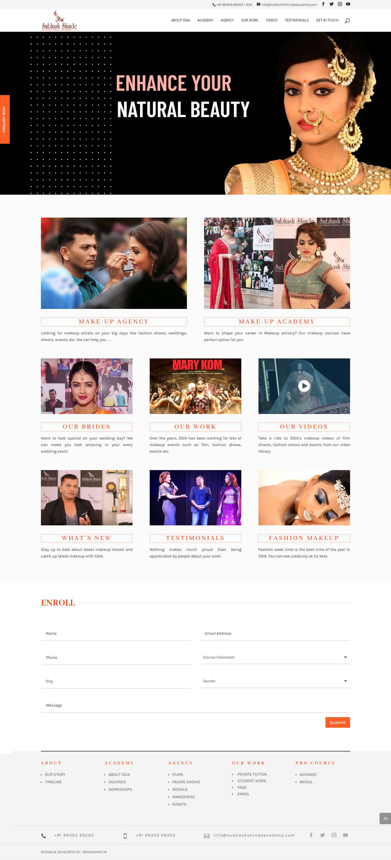
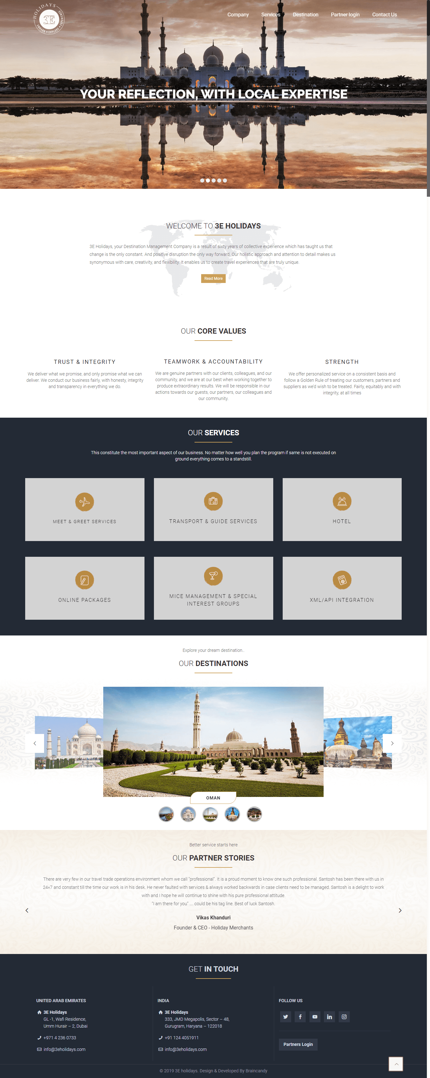
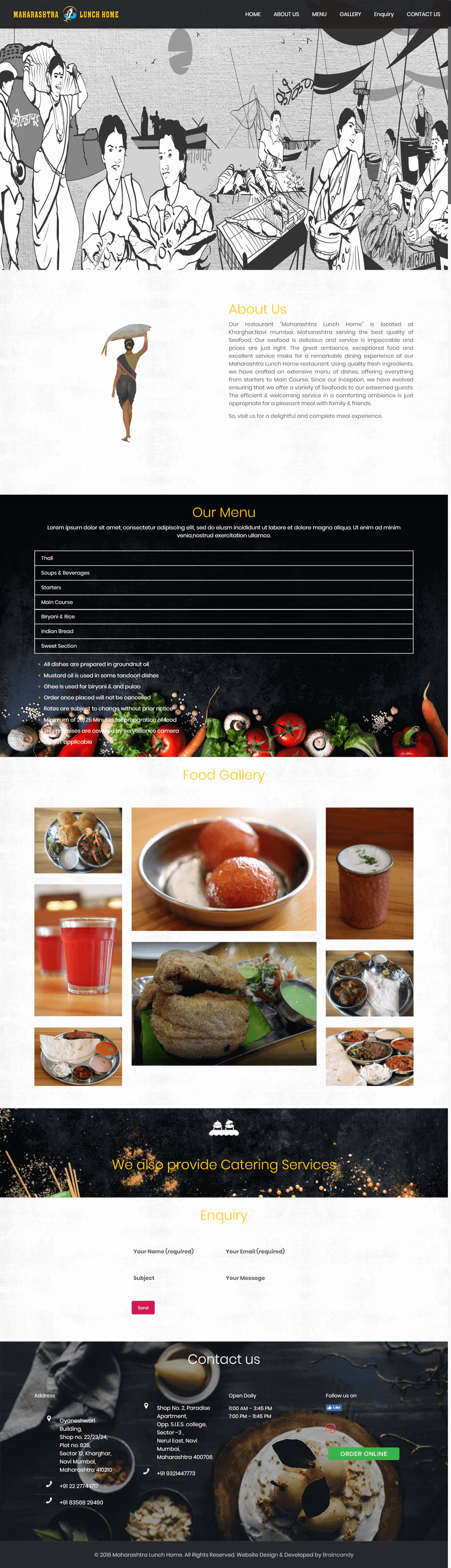
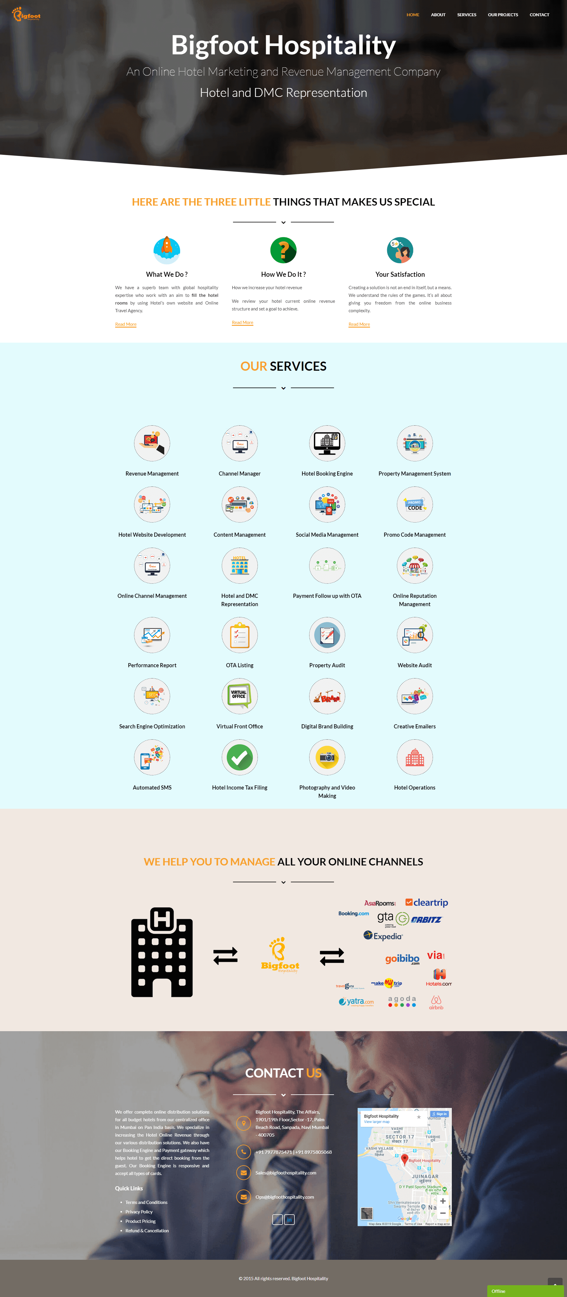
We all know that we need neat and simple navigation to hover around any websites. Earlier the screen sizes were in horizontal, hence there was a practice of keeping all the elements of the menu in the same way. With technology being advanced and wider screen is getting stretched downwards, we can see the trend of vertical menus on the websites and be honest, it’s a wonderful sight.
Here are few best websites who are following Vertical Trend:
- Petersham Nurseries: On their website, you’ll see beautiful icons representing what are they into. And when you hover over the icon, it spreads itself to another band, showing submenus. A beautiful way of showing nested vertical navigation.
- Arbor Restaurant: It has a vertical navigation with ample space in between links which are neat and clean to look at it. Also, they have aligned all the content with links that shows/hides the content as per your ease.
- Smokey Bones: On this beautiful website, on left side of every web page they have a fixed vertical navigation with logo at top left. When clicked on any link, the left navigation turns into the panel, giving sub links. When clicked on those sub-links, you’ll see content on the right panel.
- Mammoth Media: A simple 5 pages website, when clicked on it, content will appear. Also when clicked on one of the menus, you’ll get sub menu and content accordingly. A unique and neat way to represent photographic website with lesser content.
- Amazon: We all know about Amazon clearly, if you have seen the website, notice all the relevant filters are on the left side. This makes it easy to look for what your buyers need the most. A clean and neat filter clears out maximum clutter on the product- type websites.
- Corum: They have a clean website, with contrasting image, dark text and all caps links. A strong divide between the menu bar and page content shows the exact message that wanted to be conveyed to users.
- Nua Bikes: On this website, you’ll see a one-panel webpage. The vertical navigation is fixed on the left side and when you click on links, a slider of content moves up as per the link. A unique way to grab attention of both user and product at the same time.
- Michael Ngo: An award-winning website developer himself has a fantastic website. A Beautiful representation of web page with only 3 links and when clicked on submenus, you’ll see the content slider moving up engaging the user to hover on the website for a longer time.
We as entrepreneurs do want our clients or users to be on our website for longer duration. One of the current trending scenarios can make you achieve it. Vertical Navigation is best for that website which relies on extra space. These typically include portfolio sites, restaurants, small businesses, and ecommerce shops. We hope these examples can get you some ideas to start your own website.